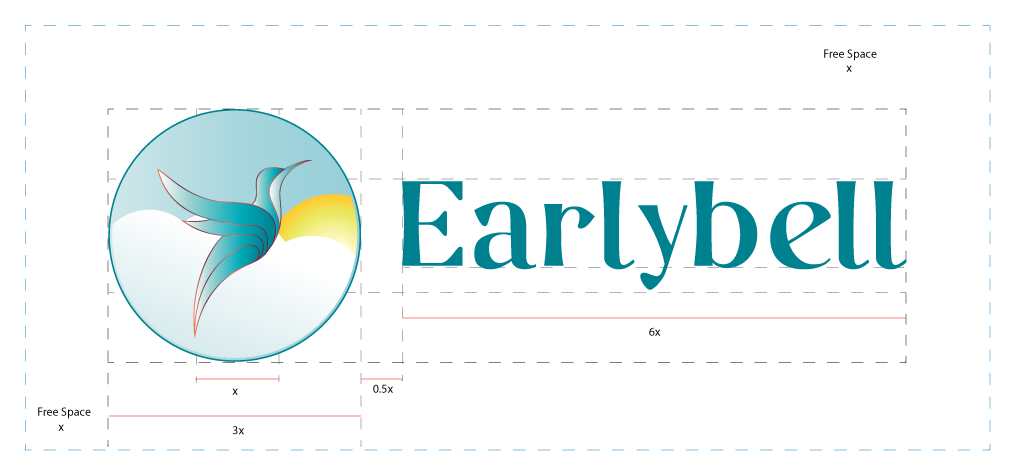
Our logo represents the ascension of our people into a world of freedom and creative energy.
The sky shows a world of endless possibilities, while the sun, is the creative energy source (Earlybell). This affords the high flying bird (the scholar) enough exposure to break barriers and maximize their creative potential.
At Earlybell we believe everyone has talent and potential. That’s why we teach with an open mind because we know that learning is possible.

This combination logo forms the signature for Earlybell. This logo can be used in any media, print or digital. Although the icon and typeface can be used separately where necessary, it’s important to strictly follow the guideline as illustrated above. X is used as the basis of measurement.
The free space helps to avoid clutter. Clarity and good exposure is needed wherever the logo is to be placed.

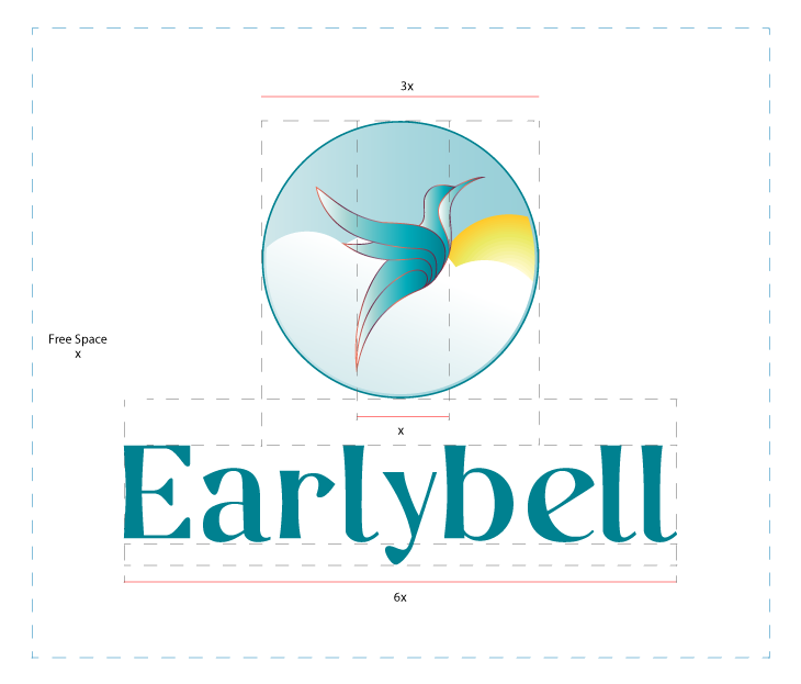
This version is an alternative to the Earlybell signature. Use where appropriate.

These are our colors. They are bright and support a good learning environment. These colors should be maintained and should not be altered. They can form the background of any visuals and can be combined to create great design.
We are bold but also approachable and creative. We love the way we are and we want to also show it through our typography. We chose the Casual-Regular typeface because it is elegant and allows you to get in that creative space, and create great work.
When we want to be very formal, we use the Poppins typeface. It is simple and clean with good readability.

This guide was created to ensure a consistent visual display of our Logo, its colors, and its meaning. It is important to strictly adhere to all the guidelines as this will have a great impact on the brand.
Join our mailing list to receive news and announcements about our training and special offer.
Privacy & Cookie Preferences | Terms of Use | Sitemap | Version: 2.1.1