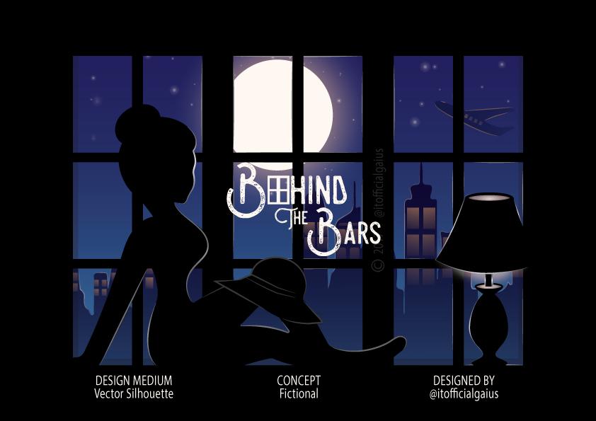
The illustration all started from a vector silhouette lady sitting by the window with an ellipse in front representing a moon.

So I felt like this should look better and more interesting than it is. So I went on tweaking the hair part of the body into a ponytail hairstyle and also adding to the illustration a building and a glow around the moon which bounces back on the lady leaving highlights on her so the scene looks more active.

At this stage, the scene started looking appealing to the eyes and getting closer to even more than what I intended to achieve. So I pressed further by adding a hat to the illustration depicting the lady’s high sense of fashion.

At this moment my love for the ponytail hairstyle was no more so I felt I change it to short hair. I went on changing the color of the hat to black for uniformity in the illustration, so I thought about what could be added to spice it up.

The illustration in other to keep it looking more active and also the more story about the lady. So I asked myself what if I add a lamp. Which is pretty much a good idea, I went ahead, did that, and added a beam of light on top of the lamp in other to bring it to life.

But wait a minute why should the building just look like lines connecting to each other to form a shape? Come on, let breathe some life into this, lighting it up would be better and tell more about the illustration. So the first building got lit up seeming like the PHNC just brought the light. Lolz

As the night got darker all buildings downtown got lit up even the light from the moon struck of the back of the building leaving highlights at the side, the lady had to intensify the light from the lamp for better illumination, and for the airplane, it is probably flying to the united kingdom.

As the lamp got intensified its left highlights round the edges of the lamp and some part of the window frame plus the light from the moon that also reflected the window frame. At this point, it seems the illustration is come to an end, or are we missing yes the stars so let’s add that to our illustration.

So now that the scene looks so interesting and tells a story what should we title the illustration? Behind the Bars is obviously our best pick. And finally, the illustration is complete HURRAY!!!

To learn more about graphic design and Illustration click here: LEARN GRAPHICS DESIGN

